
Apple’s ambitious “Liquid Glass” interface, unveiled at this year’s Worldwide Developers Conference (WWDC), has sparked a polarized reaction among users and designers. While the company describes this as its “broadest design update ever,” aimed at unifying the experience across all its platforms, early testers are reporting significant usability hurdles in the first developer beta of iOS 26.
The Technical Roots of Liquid Glass
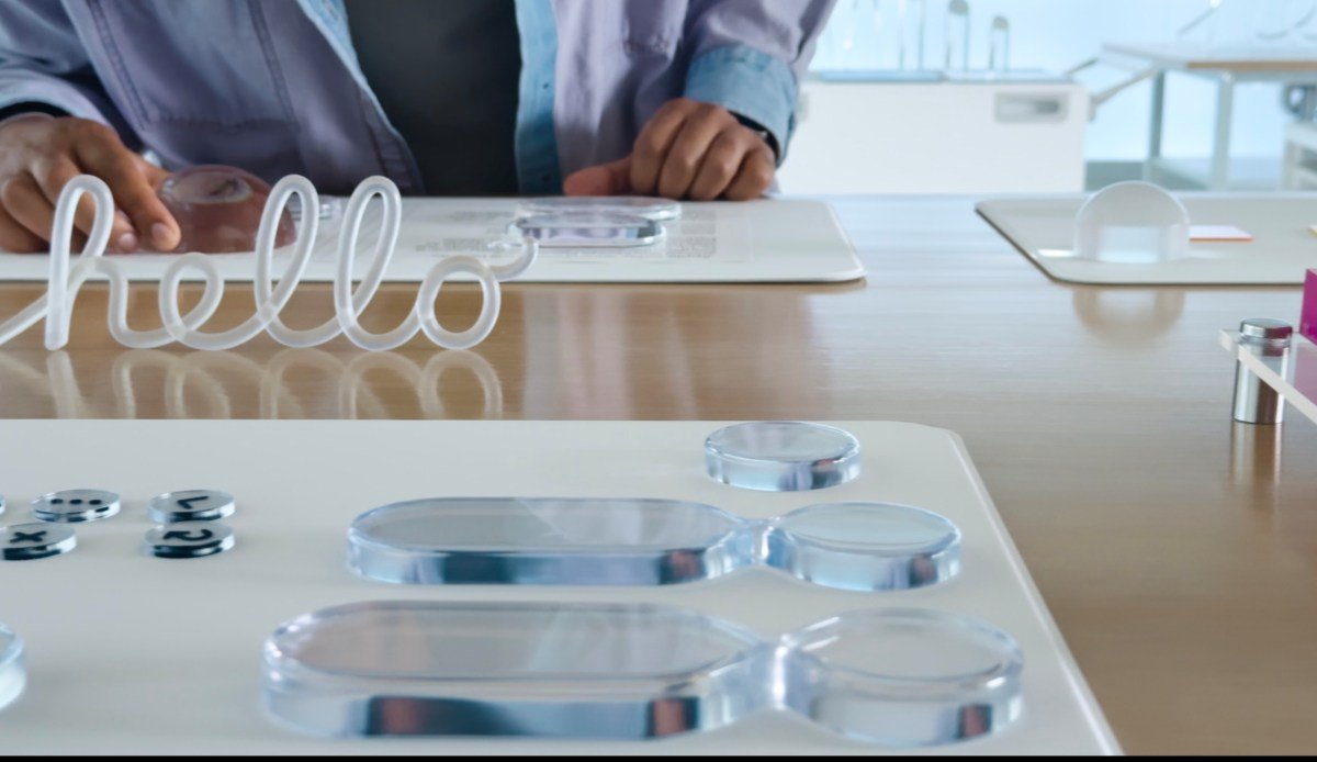
Inspired by the visual language of the Vision Pro VR headset, Liquid Glass leverages optical light refraction and translucent materials to create a modern, immersive aesthetic. Beyond current mobile devices, the design is clearly optimized for future hardware, such as upcoming AR glasses. However, the transition from concept to functional software has hit immediate roadblocks.
Design Flaws: Legibility and Control
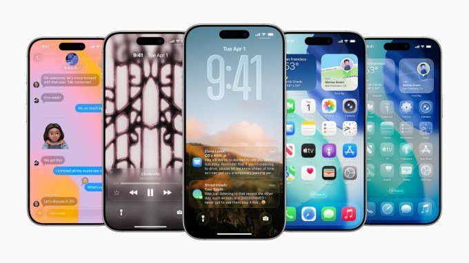
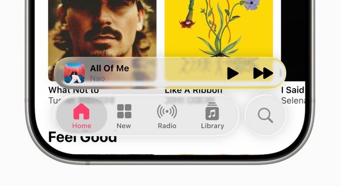
The primary complaints center on basic readability. Users report that text, particularly in notifications on the Lock Screen, is frequently obscured by wallpaper colors. This issue is not limited to third-party apps; even Apple’s official press materials highlight an Apple Music interface where light gray text on a translucent bar is notoriously difficult to discern.
Furthermore, the Control Center overlay has been described as a “monstrosity” by some testers, primarily due to a lack of sufficient background blur. This makes the interface feel cluttered and confusing, as Home Screen icons remain distracting behind the active controls.
this just seems harder to read? #ios26 pic.twitter.com/GJeHgYUHKJ
— Stammy (@Stammy) June 9, 2025
The Case for Refinement
Despite these early frustrations, there are undeniable technical achievements within the update. The new icons have received widespread praise for their artistic quality, and the physics-based animations—where windows blur and stretch icons behind them—demonstrate a high level of engineering sophistication.
These are some fantastic new icons. I love the new Camera app icon. pic.twitter.com/VbCxnzubc7
— Sebastiaan de With (@sdw) June 9, 2025
Even competitors are watching closely. Nothing CEO Carl Pei has expressed intrigue, suggesting that this design direction aligns with a future where AI-driven interactions supersede traditional app navigation.
History Repeats Itself
It is critical to remember that this is a developer beta, not a final release. Apple’s history suggests that early versions of major overhauls—most notably the transition to iOS 7—were also met with intense criticism regarding thin fonts and poor legibility. Those issues were systematically addressed before the public launch.
While concerns regarding battery drain on older devices remain valid, Apple maintains that advancements in its silicon and graphics hardware are sufficient to handle these new visual demands. As the beta cycle progresses, the focus will shift from the current “unfinished” state to the final polish of the Liquid Glass ecosystem.